General News
Published April 20, 2020
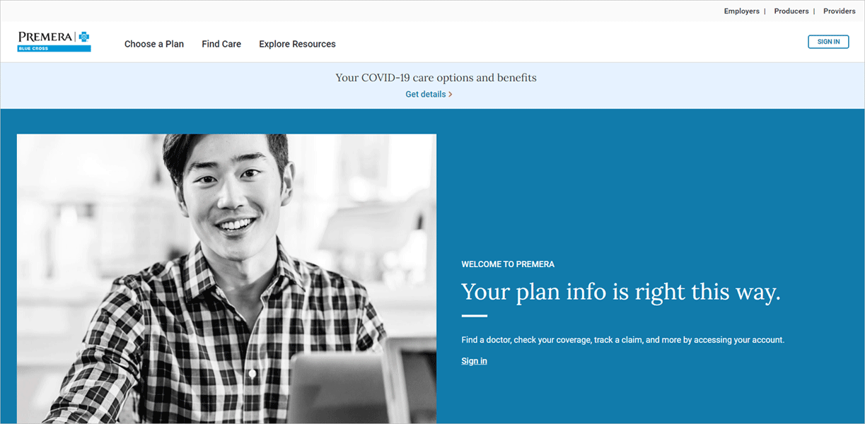
You may have noticed premera.com recently got a fresh, new look and an improved user experience.
What changed?
What you will likely notice first is that the Premera homepage and links on the homepage navigation have a more streamlined look and feel. In addition, content in the secure member website also received improvements.
How does this impact employer resources on the site?
Rest assured, you can still do all the things you would typically do on the website. The employer resources have the same look and feel. You can still access the employer resource pages, just click Employers in the top-right corner of the webpage or go to premera.com/wa/employer.
Why the change?
We listened to the feedback our members provided through surveys and the needs represented through group research. We mapped user workflows and did user testing. We also evaluated our web content for usability, usefulness, and accessibility to make sure that we offer meaningful content and choices.
What is better about the new premera.com?
- The navigation is more intuitive—making it easier for you and your clients to know where to go.
- There’s a new Quick Help section, under Explore Resources, that helps members self-serve by answering their most commonly asked questions.
- We are making it easier for your employees to understand their health plan when accessing their secure account by using clearer language. Members can now also submit claims online and have access to a simple-to-follow benefit overview.
If you have not already seen the new website, check it out at premera.com.